本文主要是熟悉微信小程序自定义组件的开发,以一个常见的导航栏(Tabbar)需求为例。
官方文档:https://developers.weixin.qq.com/miniprogram/dev/framework/custom-component/
首先我们先看一下最终实现的效果: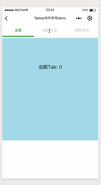
这是一个非常简单的例子,就用这个例子敲开自定义组件的大门。如果你对vue的组件很熟的话,那么你应该会轻松上手。
改组件应该具备最基本的属性和方法:
这里我还给页签切换时添加了slider的滑动动画,为了更好的用户体验
<view class='tabbar-container'> <view class='tabbar'> <!-- 页签 --> <block wx:for="{{tabItems}}" wx:key="ti+{{index}}"> <view id="{{index}}" class='tabbar-item' style='{{ activedIndex == index ? ("color: " + activedColor) : "" }}' bindtap="clickTab"> <view class="tabbar-title">{{item}}</view> </view> </block> <!-- slider 滑块,会随着选中的页签而滑动至对应的位置, 使用了CSS3的translateX属性 --> <view class='selected-slider' style="transform: translateX({{sliderOffset}}px); -webkit-transform: translateX({{sliderOffset}}px);background-color: {{activedColor}}"> </view> </view> </view> Component({ properties: { tabItems: Array, // 选中标签页的颜色(文字颜色+小滑块颜色) activedColor: { type: String, value: '#d5001c' } }, data: { activedIndex: 0, // slider的左偏移量,用这个来控制其移动的距离 sliderOffset: 0 }, methods: { // 切换tab时调用的方法 clickTab(e) { this.setData({ activedIndex: e.currentTarget.id, sliderOffset: e.currentTarget.offsetLeft }) // 触发父组件的tab-change方法,并将当前选中的tab作为参数传递给父组件 this.triggerEvent('tab-change', { activedTab: e.currentTarget.id }) } } }) .tabbar { display: flex; align-items: center; position: relative; font-size: 28rpx; box-shadow: 0 6rpx 6rpx 0 #f0f0f0; } .tabbar-item { flex: 1; text-align: center; padding: 30rpx 0; color: #b5b4ba; } .tabbar-title{ display: inline-block; } .selected-slider { position: absolute; content: " "; left: 0; bottom: 0; width: 33.33%; height: 6rpx; /* 选中页签时滑动的移动动画 */ -webkit-transition: -webkit-transform 0.3s; transition: transform 0.3s; } { "component": true, "usingComponents": {} } 不要忘了在使用该组件的页面或父组件的json文件中注册该组件:
"usingComponents": { "tabbar": "/components/tabbar/tabbar" } <view class='tab'> <tabbar tab-items="{{tabOptions}}" actived-color="green" bind:tab-change="onTabChange"> </tabbar> </view> <view class='tab-content tab-{{currentTabIndex}}'> {{'当前Tab: ' + currentTabIndex}} </view> Page({ data: { tabOptions: ['全部', '我的好友', '特别关注'], currentTabIndex: 0 }, onTabChange(e){ // 接受来自组件传递的参数 const detail = e.detail this.setData({ currentTabIndex: detail.activedTab }) } }) .tab-content{ margin-top: 10rpx; height: 200px; width: 100%; text-align: center; padding: 100px 0; } .tab-0{ background-color: lightblue; } .tab-1{ background-color: lightgreen; } .tab-2{ background-color: lightpink; } demo源码:https://github.com/JerryYuanJ/mini-app-pratice
如果对你有帮助,欢迎star。或者你发现bug也欢迎issue。